I was staring the dribbble at the most popular designs and I was intensely looking for that magical equation behind a superb interface that sets you apart from the others. I tought I have to make something incredible every time, in order to be on that top, but while visiting a famous designer’s profile, suddenly […]
I was staring the dribbble at the most popular designs and I was intensely looking for that magical equation behind a superb interface that sets you apart from the others.
I tought I have to make something incredible every time, in order to be on that top, but while visiting a famous designer’s profile, suddenly I realized something. Not all the work he created was ‘perfect’, but somehow he became better with every shot. My very next tought was: if he can do it, then I can do it.
I just need to setup a clear vision, work harder, protect my focus, learn new skills and enjoy the process.
Here are some of the tips, that helped me boost my daily basis activity:
1. Choose Your Niche. Stick With It
Your human tendency is to create all kinds of design work, a combination of many things, because you’re so passionate and you don’t want to leave people out by niching it down, but the harsh truth is that you’re not telling a clear story.
You got to distinguish yourself, by finding that one thing that you want to be known for. Perhaps you heard this before:
Good at everything and great at nothing
It’s time to cut straight to the point in your work. Curate what you share and don’t complicate things. Test out what your audience appreciate the most, give them more of that awesome work which brings you the most joy, and they will come back for more.
People will put you in a box, you only need to define that box. Sean Wes
If you create admirable logos, people will start to see you like a logo expert: ‘ Hey, I know a guy from dribbble that does wonderful logos’, but if you end up with creating different materials over and over, it will be very hard for someone to process and digest you.
2. Build Trust and Provide Value
Showing up every week with creative shots that inspire others is good, but not enough, and you feel like you need to take your business to the next level. Probably you launched a product and you are busy with gaining traffic and sales, but if you don’t have an audience, your sales will collapse at some point.
These are some of the most common cases, that designers get stuck with, and they have to change their strategies in order to survive.
It’s not the strongest of the species that survives, nor the most intelligent, but the one most responsive to change. Charles Darwin
If you have experience and knowledge, I suggest to learn and teach everything you know. Maybe you can build your own blog and provide valuable content, that resonates with people from all over the world. Talk to other designers, see what’s their struggles and help them become a better version of themselves. Don’t just spam their inbox with your product.
Stop feeding your ego and accept advises from people outside your field. You will be surprised, of how you can learn something valuable, from a random guy that take his business seriously.
Make a commitment to work every day, write tutorials, respond to their needs and turn all of this into a habit. Be consistent and let them know what to expect from you.
3. Deal Criticism With Confidence
We are working for people in the end, and if you want to stay balanced in this field, you need to know how to face criticism. Everyone is a designer these days, especially if you are working for an agency or a big corporation and yes, you know what I mean 🙂
Let’s say you’ve created a superb interface, without exceeding the deadline, almost everybody is happy with it, except a few ones. Take a look at some tips that I discovered the hard way:
Prepare for the show and bring up solid arguments. Respond with confidence. Let them know that you are in charge.
Listen to their feedback and answer with cordiality. Take a deep breath and calm down even if it’s hard. Admit if they have good ideas and be flexible.
Altough, there are a few people who want to offend you, but if you get angry, it will be difficult to manage the situation. Don’t respond and smile.
Some people hurt you and then act like you hurt them.
Increase productivity by outlining out your day. A to-do list will allow you to keep track on your progress and be mentally rewarded, that you scratched off another item of your list.
If you are in the middle of creation, you need to eliminate every possibility of interruptions: protect your focus and close your Facebook page, put your phone on silent and work for at least one hour, without interruption.
Write down these distractions and next time you will enjoy that lovely peace of mind. Try repeating the process and eventually what seamed a somewhat unappealingaction, will become a habit with productive results. Don’t forget to reward yourself 🙂
“Successful people are simply those with successful habits.” Brian Tracy
5. Improve Your Portfolio
Building a strong portfolio requires time, dedication and hard work, but in the end it is worth the effort. Its purpose is to attract future clients, with cool side projects, because you developed the ability of creating beautiful designs that work, and that prepare a freelance business life for growth.
If you still have to answer the calls of a regular day-to-day job, enhancing your portfolio might become an exhausting thing to do, that’s why you need to plan ahead sessions of ‘deep creative performance’.
Anthony Moore’s article condenses four main strategies to produce deep work depending on different lifestyles. I strongly recommend it.
Do your best and create outstanding designs, share them with the community, ask for feedback, take time and make animations, and the outcame will be spectacular.
Even if you have multiple projects with deadlines and you get to feel overwhelmed, just take a step back and relax.
Projects come and go, you will fail some and win many others. Knowing how to balance and understand yourself in the creating process is key, and over stressing with the thought of failing, will not be productive or healthy on the long term. Here’s what you can do to enjoy yourself while working:
Drink a good coffee.
Conceive your ideas on paper first. Play and test with some sketches and endure to follow your concept into complete realization.
Don’t pressure yourself too much, because it will be noticeable in your work.
Listen to your favourite music.
Take breaks, you will need them. A disconnection for a few minutes can be very helpful.
Find and work in a team.
7. Learn and Practice
Continuous learning needs to be a constant in a web designer’s life. Doing ‘good work’ is not enough. You need to be curious and challenge yourself, step out of your comfort zone to become the best designer you could be.
Work is a never ending process, that’s why no matter how busy I am, I always love to read useful articles on design principles, creative process, typography, get inspired by popular shots on dribbble and many other wonderful things, that are going on in this community.
What are your toughts about finding your niche? Are you consistent with your work? Do you feel like writing? What are your struggles right now? I would love to know.
When it all started, a few years back, I was quite unorganized and the lack of consistency throughout the web site’s elements made me look unprofessional. I gradually discovered that the best way to achieve project uniformity is by creating design documentation, or style guides. A style guide is a set of standards, principles and rules […]
When it all started, a few years back, I was quite unorganized and the lack of consistency throughout the web site’s elements made me look unprofessional. I gradually discovered that the best way to achieve project uniformity is by creating design documentation, or style guides.
A style guide is a set of standards, principles and rules every developer or designer should follow in order to improve the digital presence of the product.
In this article we will walk through effective techniques used in designing a reliant style guide. If you’re a beginner and find difficulties in creating and managing a style guide, here’s what you need to know beforehand:
First things first, design the product and afterwards the style guide.
You will need to touch base with front-end developers. Stay ahead with Bootstrap and Sass for a more productive experience with your coworkers.
Make sure there is a sense of consistency throughout all the pages whilst incorporating the company’s goal and the customer’s needs.
Include all possible details like states for buttons, titles, links, exceptions, corner cases and so on. The principle less is more is not working here.
Don’t let developers alter or adjust styles based on personal preference. Make sure they follow your design documentation.
Promote your styleguide as much as you can. Keep your team mates in the loop with all updates you may have.
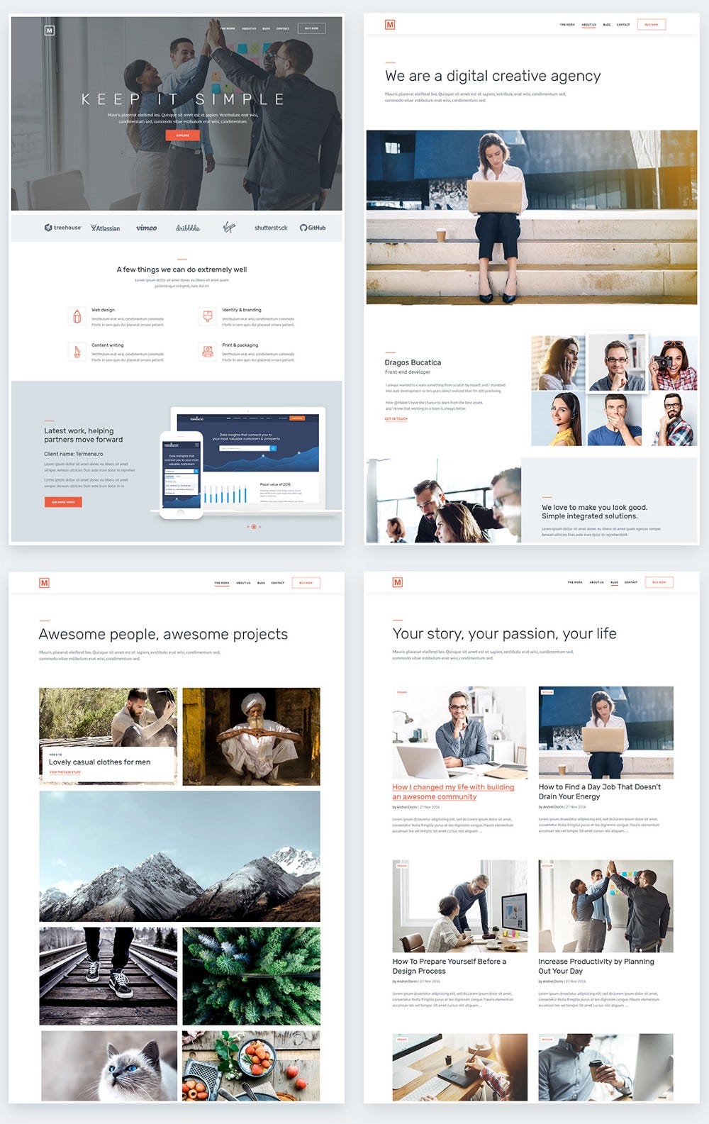
Let’s take this project for example and create its styleguide step by step. These layouts are part of a creative/multipurpose theme for agencies that I’ve been working on lately
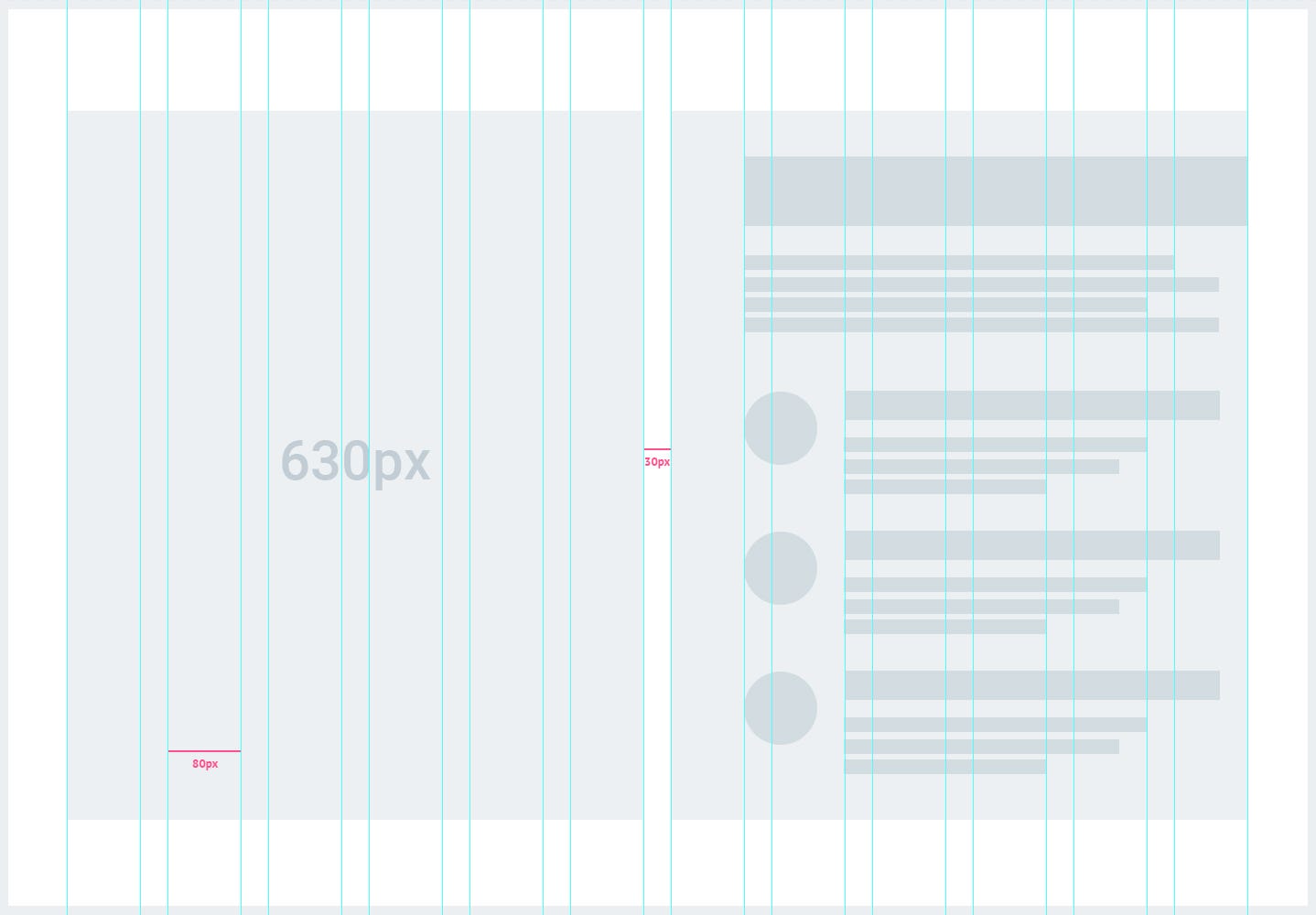
1. Grid setup
A competent layout has a solid structure behind it with a fully responsive and reliable grid, properly aligning the content. Modular grid is one of my favorite.
To set up a grid you will need to take in consideration certain mandatory aspects like container, units, number of rows and columns, margins and gutter. Developers are mainly interested in the functionality of the product, so all your elements need to be placed properly, without affecting the layout.
For my example I have a container with 1290px total width, 12 units gridand 30px gutter. To determine the px of each unit I used this app wich found that each unit has 80px.
The specific breakpoint is xl ≥ 1200px, with the content wrapped in two col-6. The result look like this:
2. White space
Be it black, white, or any other color that inspires you, the white space represent according to Mark Boulton, the empty space between the elements of your designed website.
Take advantage of your space by offering it real use and don’t try to squeeze or disperse your content. Find the middle ground; white spaces give an elegant and peaceful note which relax the eyes while emphasizing the main message.
Bootstrap helps developers focus on white space like this:
Rem is the first element within your html, and if that has 16px, this means 1rem is equal to 16px.
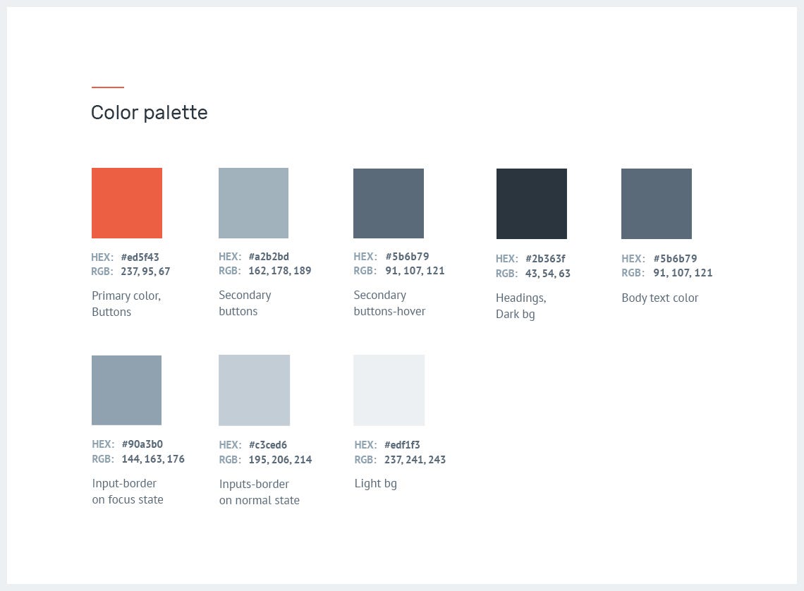
I like to start by extracting the colors, both primary and secondary, on light and dark backgrounds. For a clean look and inspiring result make sure they look perfect combined as they do on their own. For picking up the right colors, see How to choose a good color scheme for your website by Connie Wong.
Now you have to turn colors into variables. Bootstrap already has a set of variables and if you’re working with Sass, just override and replace them with your own values. You don’t need to use different names. Create a new file with .scss extension, copy /paste from this documentation and send it to your team. This will make you look professional.
Color variables$brand-primary: $orange;
$orange: #ed5f43;(the color of the logo and main call to action, the most important buttons)

$btn-primary-bg: $brand-primary; (the main buttons)
$btn-secondary-bg: #a2b2bd; (the color of the second call to action, default buttons)
$btn-secondary-bg-hover: #5b6b79;

$headings-color: #2b363f; (titles, sub-titles)
$body-color: #5b6b79 (paragraphs, ul, ol, li, labels)
$light-bg: #edf1f3;
$dark-bg: #5b6b79;
$input-border-color: #c3ced6;
$input-border-color-focus: #90a3b0;
In this case it turn out like this:
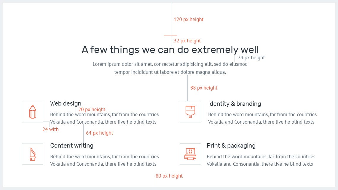
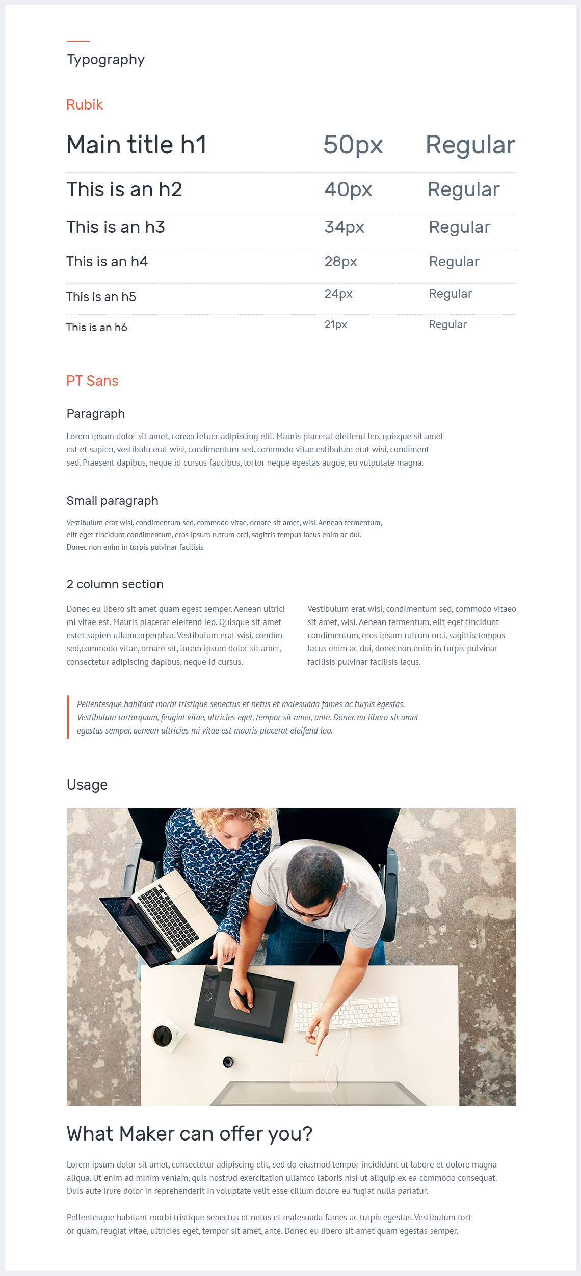
4. Typography
A correctly built typography offers the base for creating a harmonious style guide. If possible stick with one or two typefaces in order to give your text unmatched legibility, clarity, and consistency through all of the pages.
For headlines I used ‘Rubik Font Family’ and for bodies ‘PT Sans’. Make sure you bring in front details like hierarchy, weight, line-height, letter-spacing and include examples of usage in your product.
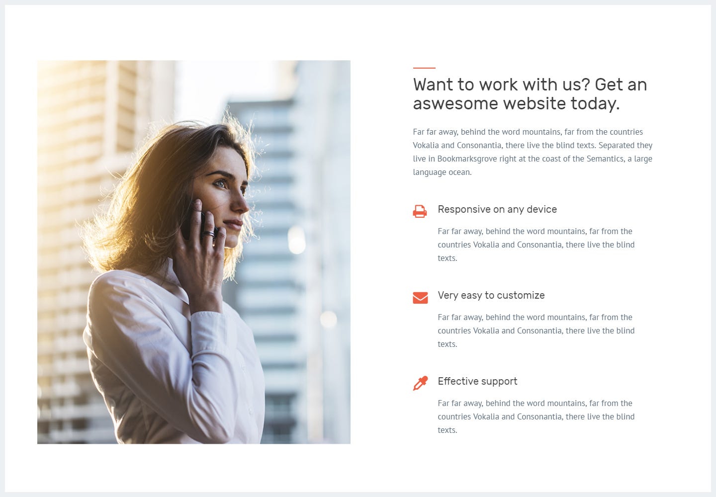
5. Imagery
It can take some time to search and pick the right images for your website, but when everything is just right the outcome will be spectacular. Invest time in the search process as images bring emotion and connect the user on a visual level.
Images used for this template are carefully harmonized with the tone of the selected color scheme; the bright work environment evokes a positive atmosphere between coworkers.
6. UI Components
Designing the components of your product can solve common issues like navigation, CTA buttons, form elements, modals, notifications and so on. Improve your style guide by adding these useful elements that create consistency and depict a better overall look.
Each one of them has its own personality, its own set of rules and properties that can interact individually as well as together, as a part of an evolving system.
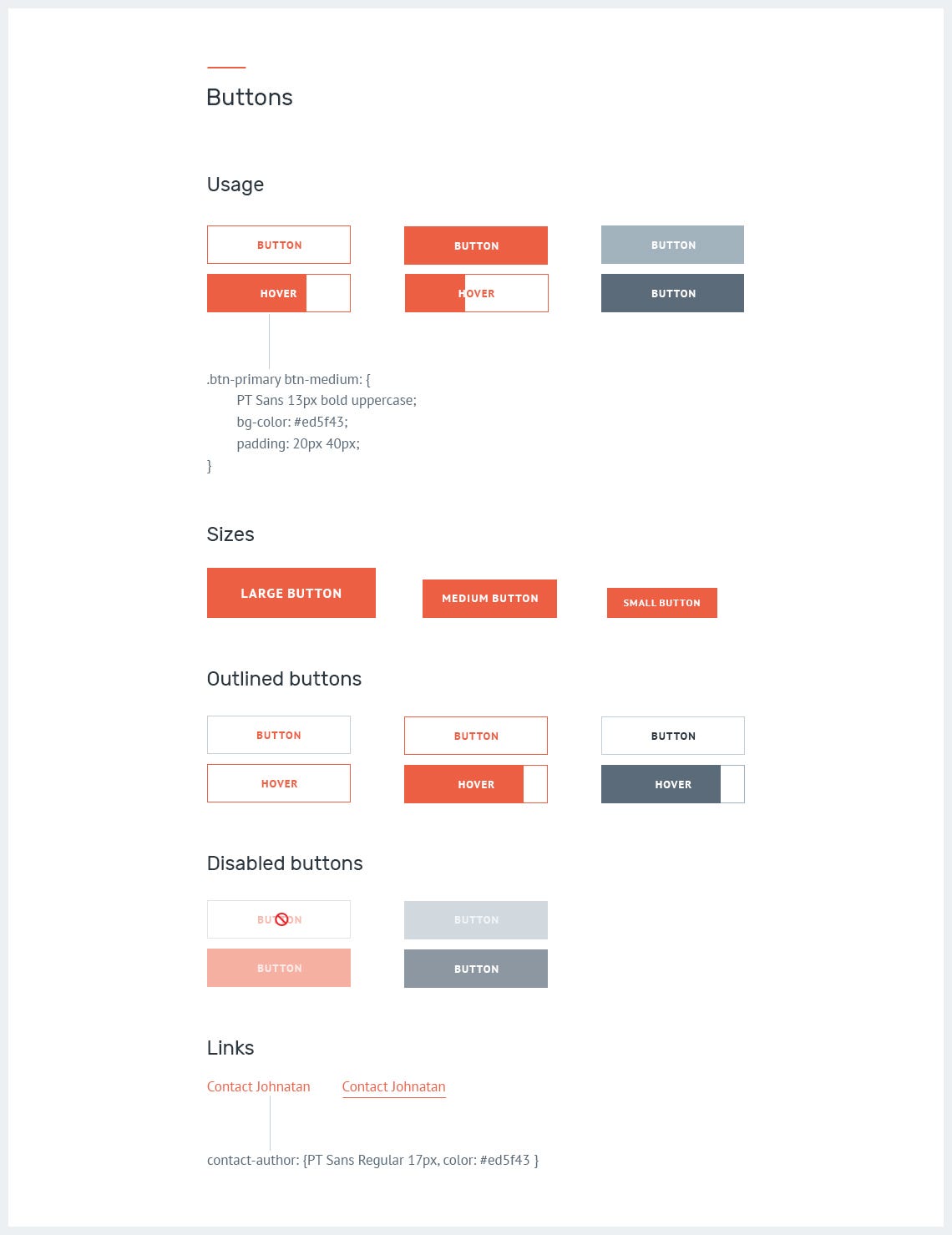
Buttons
A best practice is to group the buttons into classes: primary and secondary or (default), reversed, outlined, with specific backgrounds or borders that can easily be translated into code.
When designing buttons, make sure you bring in front details like:
Importance. Using a powerful color on primary buttons, gives a visual indicator leading the user to perform a desired action.
States. There are a few states here, but you can stick just with normal and hover and most of the time you don’t need more than that. Emphasize details like 2d transitions, shadows, icons and so on, for which I recommend using this css library effects.
Sizes. Define button sizes through classes like btn-lg, btn-md, btn-xs. For more details read bootstrap’s documentation.
Usage. Clearly defining the buttons and showcasing their real use, will allow developers to merge those details further into production with ease, whenever needed.
Form elements
Nobody wants to spend a lifetime completing a form, this is why we have to design it simple, fun and also usable. Group labels with their inputs, bring to light basic helper text wherever possible, use one column in your form, include all posibile feedback like active, valid, warning, error and so on.
I encourage you to read this article by Andrew Coyle, to prevent some common mistakes designers make, when designing web forms.
As for my article, if I made you reconsider the way you create and helped ease the process, then my work here is done.
I am a big fan of Jonathan Z. White. He has a powerful article about style guide and elements that go into building compelling products.
If you want to admire some of the best designed style guides, I recommend this article from Muzli.
As for my style guide, I decided to work with some of my friends and implement it. See live version here. I am sure there is always room for improvement. What do you think?
What are your thoughts on style guides? Let me know if I left something out. Comment down below and follow me on dribbble for more insight into web designing.
Thanks for reading. Please press ♥ for encouragement.
This site uses cookies that help the website to function and also to track your interaction with our website. But for us to provide the best user experience, enable the specific cookies fron Settings and click on Accept. Read More
This website uses cookies to improve your experience while you navigate through the website. Out of these, the cookies that are categorized as necessary are stored on your browser as they are essential for the working of basic functionalities of the website. We also use third-party cookies that help us analyze and understand how you use this website. These cookies will be stored in your browser only with your consent. You also have the option to opt-out of these cookies. But opting out of some of these cookies may affect your browsing experience.
Necessary cookies are absolutely essential for the website to function properly. These cookies ensure basic functionalities and security features of the website, anonymously.
Cookie
Duration
Description
cookielawinfo-checbox-analytics
11 months
This cookie is set by GDPR Cookie Consent plugin. The cookie is used to store the user consent for the cookies in the category "Analytics".
cookielawinfo-checbox-functional
11 months
The cookie is set by GDPR cookie consent to record the user consent for the cookies in the category "Functional".
cookielawinfo-checbox-others
11 months
This cookie is set by GDPR Cookie Consent plugin. The cookie is used to store the user consent for the cookies in the category "Other.
cookielawinfo-checkbox-necessary
11 months
This cookie is set by GDPR Cookie Consent plugin. The cookies is used to store the user consent for the cookies in the category "Necessary".
cookielawinfo-checkbox-performance
11 months
This cookie is set by GDPR Cookie Consent plugin. The cookie is used to store the user consent for the cookies in the category "Performance".
viewed_cookie_policy
11 months
The cookie is set by the GDPR Cookie Consent plugin and is used to store whether or not user has consented to the use of cookies. It does not store any personal data.
Functional cookies help to perform certain functionalities like sharing the content of the website on social media platforms, collect feedbacks, and other third-party features.
Performance cookies are used to understand and analyze the key performance indexes of the website which helps in delivering a better user experience for the visitors.
Analytical cookies are used to understand how visitors interact with the website. These cookies help provide information on metrics the number of visitors, bounce rate, traffic source, etc.
Advertisement cookies are used to provide visitors with relevant ads and marketing campaigns. These cookies track visitors across websites and collect information to provide customized ads.
Cookie
Duration
Description
cookielawinfo-checbox-analytics
11 months
This cookie is set by GDPR Cookie Consent plugin. The cookie is used to store the user consent for the cookies in the category "Analytics".
cookielawinfo-checbox-functional
11 months
The cookie is set by GDPR cookie consent to record the user consent for the cookies in the category "Functional".
cookielawinfo-checkbox-performance
11 months
This cookie is set by GDPR Cookie Consent plugin. The cookie is used to store the user consent for the cookies in the category "Performance".