Designing a positive checkout experience that perform well above average is something you cannot learn over night. Many A/B tests in which your shopping cart is failing against competitors, may lead you to a succesfull final one. This is what I call a great story of improved progress.
The more layouts you design, the closer to producing greater ones you are.
“You can’t get to quality without first going through quantity.” Unknown Author
You need to learn things like conversion rate, cart abandonment, billing information, payment methods specific to different countries and many other practicable things.
Our goal is to make the shopping experience easy and supportive for client’s customers. They’ve learned to expect the worst when shopping online and we must avoid that and show them the contrary.
Think more, design less
This isn’t a piece of work with a unique appeal, that we plan to post on dribbble, to get more likes and followers. It’s about numbers, profit, sales and the most important thing is: tocreate a perfect environment that allow income growth to occur.
Before we dive in…
Here are a few suggestions for when you’re designing checkout flows:
1. Study the Audience
Designingfor the user is a concept that seems to get lost so often, and we fail to remember that, a user is a human. Get disciplined and study your audience. Establish a meeting with your client, or send him a questionnaire.
Make sure you touch some common topics like:
What problems his customers encountered so far, within the actual checkout process?
What are their special traits and needs?
What is the cart’s abandonment rate?
In which category his products fit in: electronic delivery or physical goods?
Get aligned with the goals and voice of the company and you’ll be able to create a superb checkout design, that works most effectively for its audience.
For example, a checkout design for a company who sells software, is different than the one for a company that sells clothes. In the first example you don’t need to fill a physical address input, in order to receive your product, because an electronic key can be sent via email.
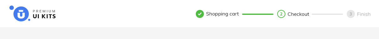
2. Provide Progress Map Indicator
A progress map indicator above the entire form, can visually inform our shopper that he is on the right track. I don’t encourage you to break a smooth and linear process, by inserting a mandatory sign up form in the middle of it, that holds nothing back but our user, from completing his purchase.
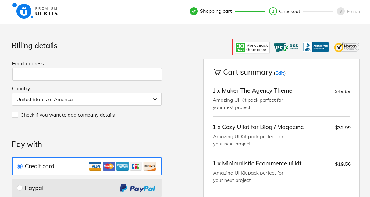
For a better understanding, I will show you a checkout design, that I did for my website. Here, the flow is structured into three simple steps and it looks like this: Shopping cart > Checkout > Finish
This image describes well at what stage of the checkout process our user is at, and how long there is left to go.
There are more alternatives of checkout purchase flows, that you can follow:
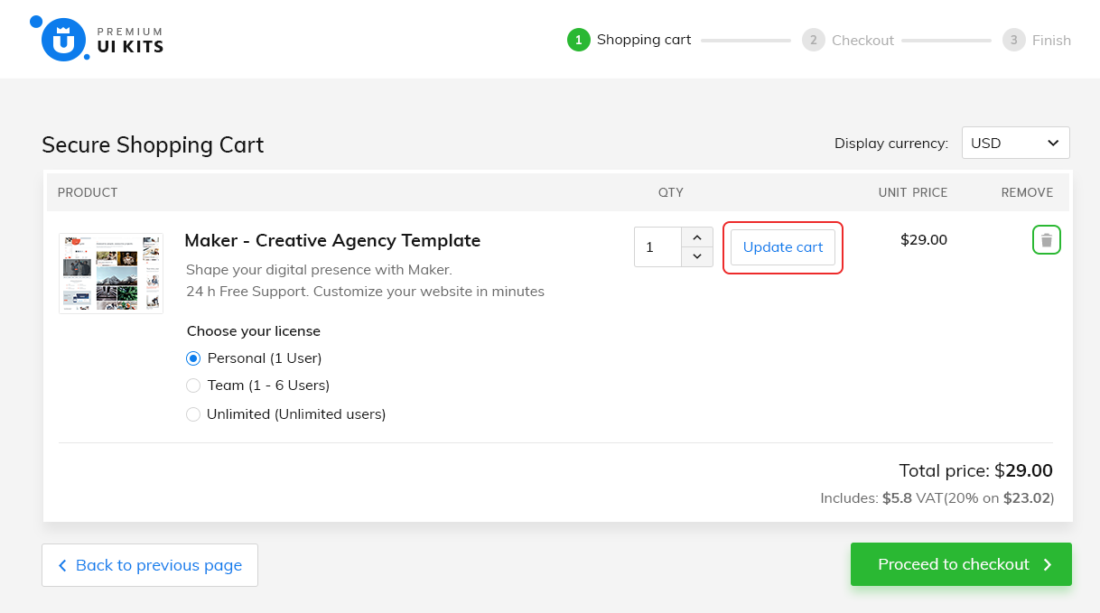
a) Shopping Cart Checkout
This is the standard flow, that almost every user is familiar with. Once you agreed with your selected products, you’re ready to proceed to the checkout page. If your payment is authorized, you can review your information on the thank you page. This is what I’ve used in my example.
b) One Page Checkout with Review
If you want to speed up the purchase experience, this is the perfect flow. A landing page with all of the three sections: shopping cart, billing & payment form. Add a different background on the payment form, to visually separate this two areas (billing from payment). Take a look at my landing page, for a better understanding.
The Continue button is the main call to action in this case, that redirects you on the review page, where you can hit the Place order button in order to finalize your payment.
c) One Page Checkout without Review
This is the shortest purchase flow with only two steps (checkout & finish). Very similar with the above one, except one thing: the place order button is on the same page. No review page required.
3. Don’t Use Any ‘Update Button’ to Modify a Value
There is an entire anatomy behind an effective shopping cart, but how can we actually build an effective one? Let’s start with the update button.
Every customer wants to simply adapt things within their cart, especially by increasing or decreasing the quantity of his desired product. Make it easy to modify and use AJAX for getting quick and real time results, without refreshing the entire page.
We all know that shoppers frequently change their mind and remove products from their shopping cart. A bad practice is to force them to enter the zero amount in the quantity input. Simplify the whole process, by adding a trash icon or a delete link next to each product.
4. Display The Gross Price from Start
How many times did you find yourself surprised, after you saw a final bigger price with all the taxes and shipping costs, included?
It can be very frustrating and I don’t know who to blame, I think it depends on how we get used to pay. We can debate here for decades, but I think the best approach is, to expose the gross price straight from the shopping cart. 8% buyers abandon their cart because they have to pay for taxes.
In my case the unit price is the same with total price, just to avoid any misunderstanding. Now, he is aware of what he’ll end up paying for.
5. Don’t Embrace The Coupon Code Redemption
Everyone is thirsty for discounts. We all love them. Who doesn’t want a discount? It feels good when you found a better deal, it makes you look smarter than other shoppers, who paid the highest price.
A coupon code input placed inside your cart, will throw people out to search for codes. If couldn’t found, they’ll most probably abandon the cart, because they know that someone, once had a better deal.
Companies offer discounts, when sales drop down. Lower prices, cheap products, great deals, more money and happy customers, except few ones: the loyal customers.
They are the ones who buy the most from you. Discounting your products after a period, will make them look foolish, because they couldn’t wait. Discounts devalue products, so brand wisely.
If you can’t have a meeting with your client, send him a questionnaire and ask him what kind of a brand is he running? A premium brand or a discount one? Does he want to have a discount coupon inside his shopping cart?
I don’t plan to use a discount strategy, if the name of my brand is premium ui kits. I don’t want to ignore the loyal buyers, so I don’t use coupon codes inside the shopping bag.
If you still want to use coupon codes inside your cart, here’s an interesting debate on how to use them the right way.
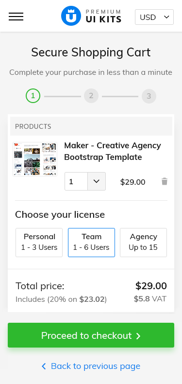
6. Design for the Smallest Screen
In order to achieve an effective design, you need to adopt the mobile first approach and then progressively design your way up for larger devices. Start with the essential features, cover all the hardest scenarios and you will be able to adapt your design with ease. This is the best strategy, that keeps you away from any unpleasant surprise.
The hardest thing is to create a simple thing
Imagine that you go with the opposite strategy: squeezing an entire content into a small screen. You need to do a lot of hardcodes and make unhandy edits around your content. Altough this process seems very unnatural and cause serious headaches, many designers still go this way.
Take responsibility and prioritize the mobile-first approach. Start with the smallest breakpoint (iphone 5), use its own native design elements as much as you can (see the quantity input), and then scale up.
Content is king
Turn limitations into benefits, learn to emphasize the most important features, and bring in front the reason why people visit your store: the products.
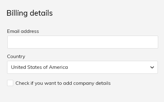
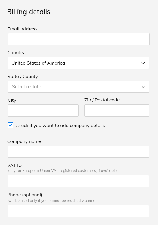
7. Save ‘Data Entry’ by Offering Compact Forms
Nobody wants to spend more than a few minutes to fill out a form, that’s why a good ideea is to create simple, compact forms that save time and reduce stress for our customers.
It’s all about the user in the end. Appreciate his efforts and humanize the entire completion process, by reducing the number of the unnecessary fields. Make it more enjoyable and you’ll end up with more sales and returning customers.
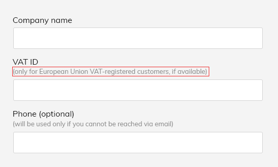
In my case I realized that I can move Phone, Fax number and VAT ID(for European countries), under the company’s details (for those who want to buy as a company). For instance,instead of having two inputsfor First and Last name, youcanmerge them into a single one named Full name or First and Last name to save more space.
Get the most out of your forms, by using contextual fields display. What exactly this mean is that some additional elements are activated by a certain action. For example if you select USas Country, fields like State, City and Zip code will appear immediately below and only below.
Shortest Scenario
Longest Scenario
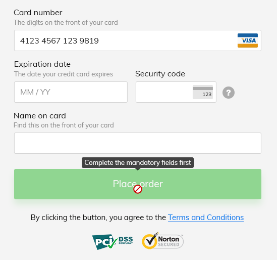
You can apply this procedure, on the main call to action, the Pay Now button or Place order, or whatever you want to name it. Fade out this button by decreasing its opacity and add that forbidden icon at hover, along with a tooltip, that generate an informative message, something like: complete the mandatory fields first. After that, the button will turn on.
Payment button activates after all the mandatory fields are completed
8. Expose Descriptive Texts As Much as You Can
One of the main reasons people gave up on their purchase is because they couldn’t complete out a form. It is a designer’s role to create good and usable forms, that defeat any barrier in finishing an online purchase.
Many users have serious problems understanding, how to complete and what’s expected from them, when inserting data into an input.
Descriptive texts come in handy everytime. Wherever you want to place them, next or below to a label, it doesn’t matter as long as you provide clear instructions. If you have complex helper texts, hide them behind a tooltip that generates its content, when users hover an informative icon, but that’s not the best approach. Bring out to light these useful details, and your conversion rate might significantly increase.
Andrew Coyle has an amazing article on how to avoid some of the common mistakes, designers make, when designing web forms.
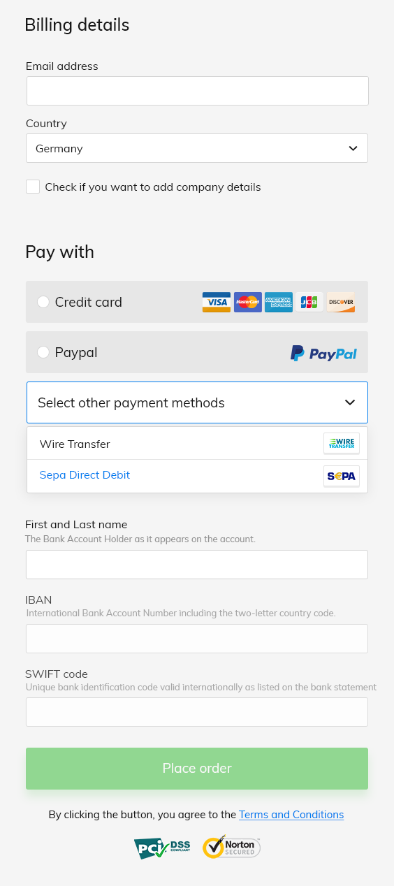
9. Include Country Specific Payment Methods
Payment details are the most important part within the checkout process. Adapt them for your audience and bring out to light all the descriptive texts, near to each label.
If you have an international business, with high orders amount, it’s always a good ideea to fidelize your customers, by offering them local payment options, relevant in their countries.
For example if your shopper is from Germany or Austria, you can bring up Sepa Direct Debit and Wire Transfer along with the regular Credit card and Paypal. Here is a list with the most popular payment methods by country.
Payment Form on Germany
10. Ensure User Security By Visually Inserting Trust Marks
Customers choose to shop more online, if offered with simpler and secure payment options. Even that, the credit card security and online payments fraud, remain the biggest issues nowadays.
People make business with you, only if they trust you and your company. If you don’t have a checkout page that hit that ‘safety note’ with trust marks, badges, or money back guarantee logos, good luck closing online orders.
Many of us, hesitate to introduce our credit card details on an outdated website, that doesn’t look secure enough. Here’s a short list with the most important security certificates, that ensure protective measures on your payment form.
PCI DSS— Payment Card Industry Data Security Standard
You can place them at the top of your page for high visibility. In my design it turned out like this.
Trust logos displayed
11. Thank you page
Don’t underestimate this final step. An important aspect here, is to set typography right, for establishing a visual hierarchy within your content.
Start with a headline, that shows your gratefulness. This means that you appreciate their efforts.
Emphasize the most important message, the one where you provide them clear instructions. Let them know to check their email address (spam/junk included), in order to access their goodies.
I strongly recommend this useful article, that contains some of the best techniques on designing a great thank you page.
Conclusion
The purpose of this article is to makeyou design better checkout flows, that help even the most inexperienced customers completing the purchase.
Every time you want to change something, A/B test and see if it improves the entire shopping experience. Listen to the customer’s needs and justify any change you make.
Keep in mind this collection of practices next time you design a checkout flow and tell me if it helped you.
Hi guys, how are you today? Do you feel inspired? If you feel stuck, please welcome this collection of Mobile UI Designs for IOS. We’re glad to be part of this awesome community of designers and artists who struggle every day to create something beautiful. Stay open and don’t forget, inspiration comes within simple things. […]
Hi guys, how are you today? Do you feel inspired? If you feel stuck, please welcome this collection of Mobile UI Designs for IOS. We’re glad to be part of this awesome community of designers and artists who struggle every day to create something beautiful. Stay open and don’t forget, inspiration comes within simple things.
“Design can be art. Design can be simple. That’s why is so complicated” – Paul Rand
Monday morning finds me at the office, drinking my coffee with my colleagues. After only a few minutes, we’re about to begin the SCRUM meeting, to plan out our tasks and goals for the week. Everything was set up, but first I opened some of the latest design trends websites that I follow, to get […]
Monday morning finds me at the office, drinking my coffee with my colleagues. After only a few minutes, we’re about to begin the SCRUM meeting, to plan out our tasks and goals for the week. Everything was set up, but first I opened some of the latest design trends websites that I follow, to get my daily inspiration.
Even if we established our tasks and top priorities, a lots of emails came up with problems that needed to be solved, immediately. I was constantly being pulled in too many directions, so how can I stay creative when multi-tasking? I have to eliminate distractions and do nothing more but work.
A cup of coffee and a chillout set of good tracks was enough for me to calm down and complete my tasks, but that was only the beginning.
After a few hours, a teammate arrived at my desk and said that I have to leave everything else to create some ui elements for another project. I didn’t know what to work on first, but the next minute I was deeply covered in anxiety and stress. I certainly remember how I began to open random tabs, check my e-mail every two minute, over and over again.
I was screaming, cursing, kicking, yelling and my sense of completion that day was: tons of work and finally I did nothing. How to handle this situation from now on?
I do not consider myself a “delicate genius” ( and you know there’s a but I need certain things to increase my creativity and focus while working. Here are some helpful tips that I discovered the hard way :
1. Work with your manager to prioritize your tasks
Your manager is the person you should rely on for time managing your projects. He is fully aware of what tasks demand your full attention and how to complement them with other less stressful tasks in order for you, to give the best results.
Even though I frequently embark on one or two major projects a week and I try my best to finish them, his provided structures make my working days a lot easier.
2. Do your best to finish one important task per day
Increase productivity by planning out your day. A to-do list will allow you to keep track on your progress and be mentally rewarded that you scratched off another item of your list.
First thing first, you need to know that our projects are often divided into two major categories, according to Steven Covey:
The big rocks — these are the most important projects of your list, and you need to work your ass off in order to complete them. Protect them, by locating serious amount of time and remember that these are the ones that actually matter. Altough, there are numerous urgents, that may appear in your day: colleagues that need your help with some adjustments at some mockups for instance. Educate them by asking: Is this important? I am in the middle of something very important that needs to be done today. If they persist, listen their needs and then decide if this is really crucial. Many times my reply is: “Well this can wait a bit, and I will do my best so you can have it today, later, or tomorrow in the morning”. Next time, they will think twice before they come to you.
The sand — represents the little things or tasks with slight, but manageable consequences if we don’t do them. Sand express all the phone calls, distractions, pings from social media, emails and somehow we want to be distracted by all these meaningless things. If you are in the middle of your best focused time, you need to eliminate every possibility of interruptions: close your Facebook page, put your phone on silent and work for at least one hour without interruption. Try repeating the process and eventually what seamed a ‘somewhat unappealingaction’ will become a habit with productive results. Don’t forget to reward yourself 🙂
Remember: It is easier to sneak dust into a big glass full with rocks, rather than to put rocks in a glass half filled with sand.
“Successful people are simply those with successful habits.” Brian Tracy
3. Stop pressuring yourself
No matter how good you are at planning, the pressure never goes away.
I will always try my best to finish my tasks, but if I do not succeed there’s NO PROBLEM.
If you feel that creatively you’re at the ‘squeezing water from a stone’ point, just take a step back and relax.
Projects come and go, you will fail some and win many others. Knowing how to balance and understand yourself in the creating process is key, and over stressing with the thought of failing will not be productive or healthy on the long term.
In time, as a web designer, you will challenge yourself and learn what projects suit you best. As a measure of precaution allways be honest with what you can bring to a project and don’t get too cocky when promising results. Failing is one thing, but failing from a higher ground might ‘break some bones’, including the reputation one and we don’t want that.
What I learned. Don’t pressure yourself too much, because it will be noticeable in your work and always be honest about what you can bring to a project.
4. Take breaks. You will need them
You’re the engine behind the masterpiece and you need to hit the pit stop from time to time. Even if it’s a simple empty stare into the distance or hitting the gym on your lunch break (heard some people do that, now that’s what I call ambitious) a disconnection from work is needed.
I usually go outside with my closest colleges for a nice cup of tea and have a chat to rewire and unwind. When something bothers me, it helps to dissect the problem with them, get to the root and find a solution.
Chatting with others will help you identify other stressful factors and bad habits among others. Admit you have a problem, dispute it, ask for their opinion and use your logic to replace your wrong ideas with new healthy ones.
5. Communicate and set real expectations
I was talking before about being honest when it comes to what you can bring to a project and not promising unrealistic results.
We’ve all done it at least once: took on multiple projects and got so buried in work, that we barely saw the light of day. While some people get along fine without the light of day, I do not, and I learned in time, that is best to set real expectations for me and everyone involved in the project.
Deadlines, need to be rightfully set taken in consideration, that a unique design does not happen over night and projects done in a hurry, have a higher chance in failing during demo as certain things might have been overlooked.
A meeting with all the departments involved in the project will set real expectations for everybody, as a trial and error with a perfect result is not a one hour job. Everybody should ask questions about functionality, flows, particularly cases, cooperate and learn to use their knowledge, work together in order to release the best project yet.
6. Average work is not for you
Continuous learning needs to be a constant in a web designer’s life. Doing ‘good work’ is not enough. You need to be curious and challenge yourself, step out of your comfort zone to become the best designer you could be.
Work is a never ending process, that’s why no matter how busy I am, I always love to read useful articles on design principles, usability, typography, get inspired by popular shots on dribbble and so on.
Thanks for reading, I hope this will help 🙂
This site uses cookies that help the website to function and also to track your interaction with our website. But for us to provide the best user experience, enable the specific cookies fron Settings and click on Accept. Read More
This website uses cookies to improve your experience while you navigate through the website. Out of these, the cookies that are categorized as necessary are stored on your browser as they are essential for the working of basic functionalities of the website. We also use third-party cookies that help us analyze and understand how you use this website. These cookies will be stored in your browser only with your consent. You also have the option to opt-out of these cookies. But opting out of some of these cookies may affect your browsing experience.
Necessary cookies are absolutely essential for the website to function properly. These cookies ensure basic functionalities and security features of the website, anonymously.
Cookie
Duration
Description
cookielawinfo-checbox-analytics
11 months
This cookie is set by GDPR Cookie Consent plugin. The cookie is used to store the user consent for the cookies in the category "Analytics".
cookielawinfo-checbox-functional
11 months
The cookie is set by GDPR cookie consent to record the user consent for the cookies in the category "Functional".
cookielawinfo-checbox-others
11 months
This cookie is set by GDPR Cookie Consent plugin. The cookie is used to store the user consent for the cookies in the category "Other.
cookielawinfo-checkbox-necessary
11 months
This cookie is set by GDPR Cookie Consent plugin. The cookies is used to store the user consent for the cookies in the category "Necessary".
cookielawinfo-checkbox-performance
11 months
This cookie is set by GDPR Cookie Consent plugin. The cookie is used to store the user consent for the cookies in the category "Performance".
viewed_cookie_policy
11 months
The cookie is set by the GDPR Cookie Consent plugin and is used to store whether or not user has consented to the use of cookies. It does not store any personal data.
Functional cookies help to perform certain functionalities like sharing the content of the website on social media platforms, collect feedbacks, and other third-party features.
Performance cookies are used to understand and analyze the key performance indexes of the website which helps in delivering a better user experience for the visitors.
Analytical cookies are used to understand how visitors interact with the website. These cookies help provide information on metrics the number of visitors, bounce rate, traffic source, etc.
Advertisement cookies are used to provide visitors with relevant ads and marketing campaigns. These cookies track visitors across websites and collect information to provide customized ads.
Cookie
Duration
Description
cookielawinfo-checbox-analytics
11 months
This cookie is set by GDPR Cookie Consent plugin. The cookie is used to store the user consent for the cookies in the category "Analytics".
cookielawinfo-checbox-functional
11 months
The cookie is set by GDPR cookie consent to record the user consent for the cookies in the category "Functional".
cookielawinfo-checkbox-performance
11 months
This cookie is set by GDPR Cookie Consent plugin. The cookie is used to store the user consent for the cookies in the category "Performance".